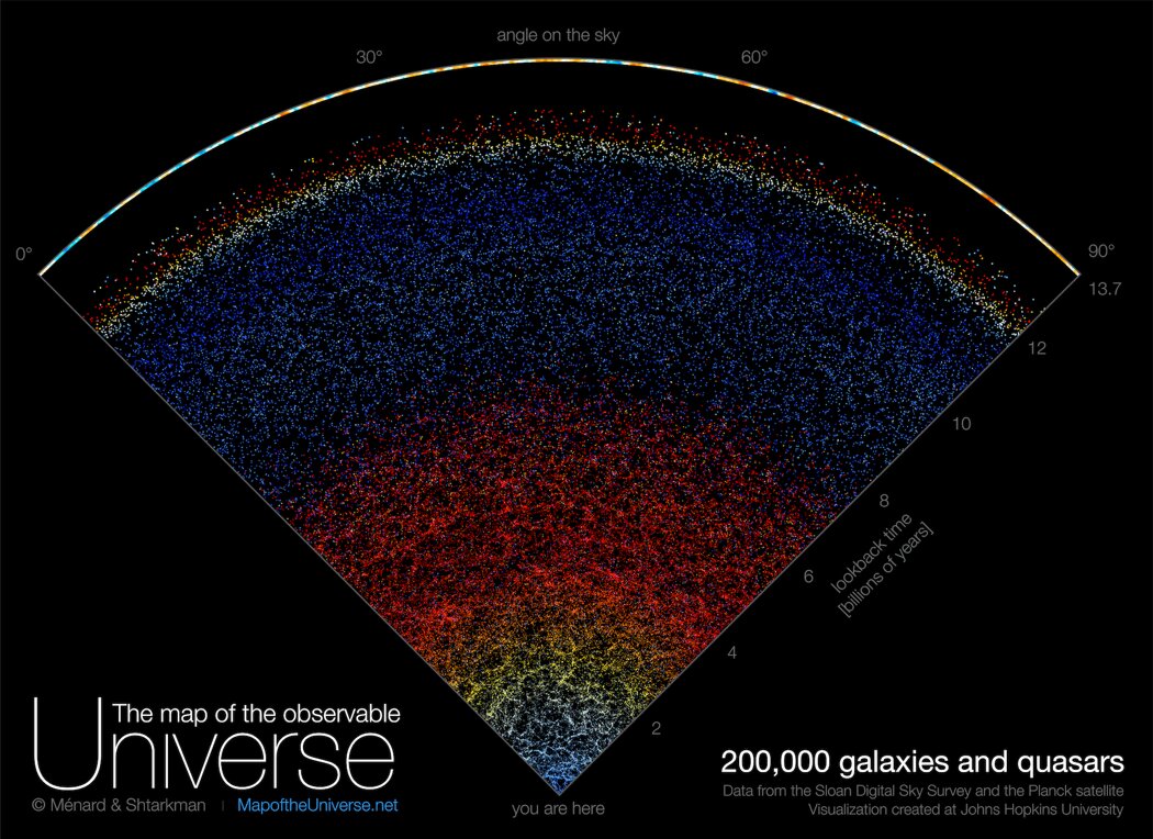
A team of astronomers from Johns Hopkins University has published a new interactive map of the Universe. It demonstrates the location and actual colors of 200 thousand galaxies.

The map was created based on data collected as part of the Sloan Digital Sky Survey. This project has been implemented since 2000. Within its framework, astronomers are conducting studies of the spectra of stars and galaxies using a 2.5-meter wide-angle telescope installed at the Apache Point Observatory in New Mexico.
The map created by the researchers combines data about a section of the Universe that occupies about 10° from the circular view. Our Milky Way is located in its lower part. Then we see a lot of blue dots. They correspond to neighboring spiral galaxies resembling ours. Each of them consists of billions of stars and planets that may be home to other life forms. Behind them are elliptical galaxies. They are yellow in color and glow brighter than spiral galaxies, which makes it possible to find them at a greater distance.
It can be noted that the further we move away from the Milky Way, the redder the galaxies become. This is due to the increase in the wavelength of light emitted by them, caused by the expansion of the universe.
The next region of blue dots corresponds to quasars — the nuclei of galaxies, in the centers of which supermassive black holes are located. These are some of the most distant objects in the universe, the light emitted by them takes more than 10 billion years to reach the Earth. The upper part of the map is formed by the cosmic microwave background (relic radiation). This is the “echo” of the Big Bang, marking the boundary of the observable part of the Universe.
The full version of the Universe map is available for viewing and downloading on the project website.
Follow us on Twitter to get the most interesting space news in time
https://twitter.com/ust_magazine
