
The NASA logo is one of the most popular images of our time. It can be seen on clothes, hats, and various souvenirs. But how did this image appear and what does it mean?

Creating a NASA logo
To find the answer to this question, we need to go back almost 70 years in time. It all started on July 29, 1958, when Dwight Eisenhower signed a law creating a new organization tasked with controlling all non-military activities related to space exploration. It was called NASA (National Aeronautics and Space Administration).

NASA officially began operations on October 11, 1958. Naturally, the newly created organization needed its own “distinguishing marks” in the form of a seal and emblem. James Modarelli, the head of the Research Reports Department at the Lewis Research Center (now the Glenn Research Center), took on this task. A team of artists under his leadership designed the NASA seal to be used in the organization’s official document flow. Initially, it was black and white, but in 1961, a color version was introduced, which remains unchanged to this day.
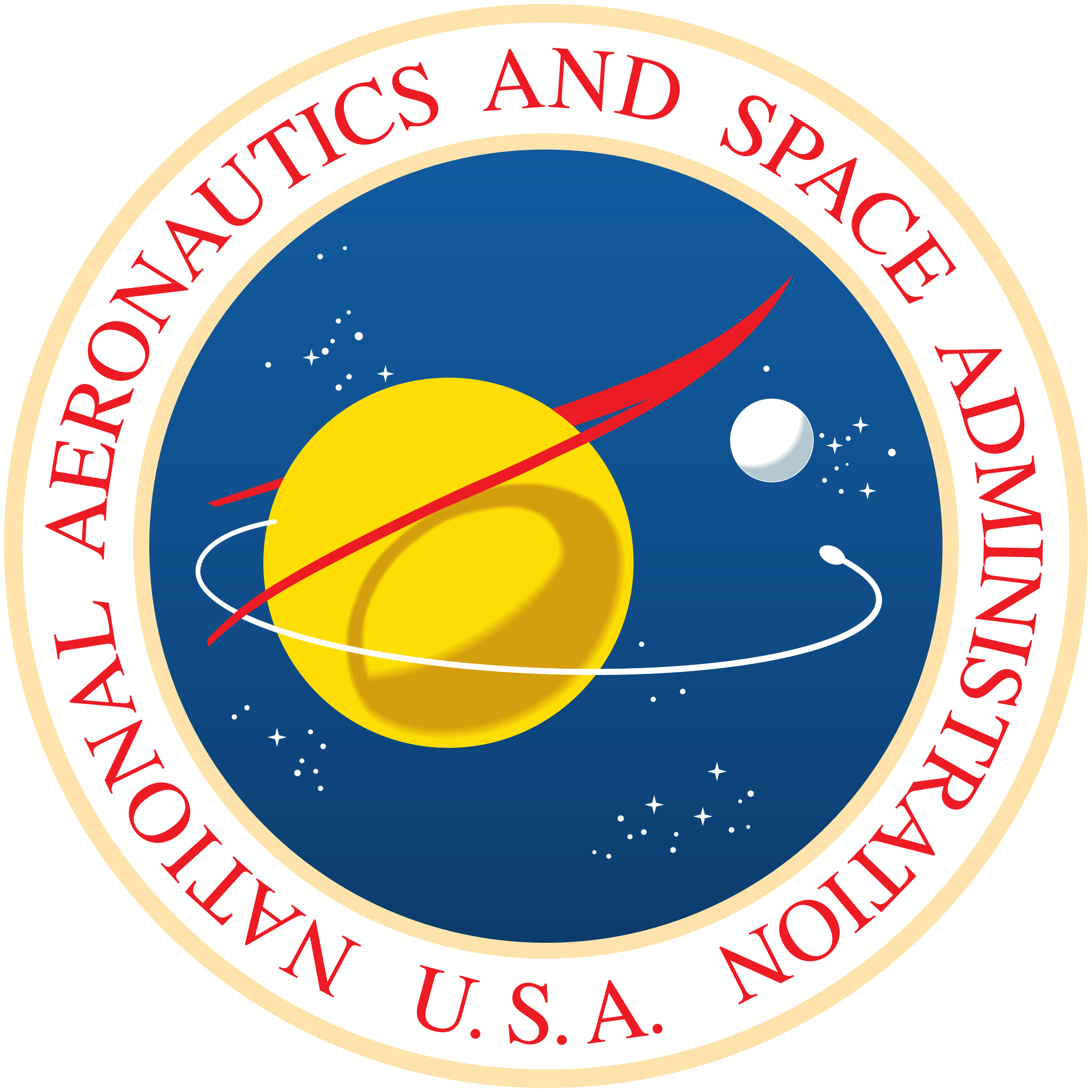
The basis of the NASA seal is a blue circle with our planet and its satellite, a scattering of stars, a trail of a spacecraft moving in orbit, and a distinctive red profile. The latter symbolized the latest design of hypersonic vehicle wings at that time.
In addition to the seal, the organization also needed an emblem (logo) for less formal use to popularize NASA’s activities. It was planned to be applied to clothing, equipment, and infrastructure of the aerospace administration.
James Modarelli also volunteered to solve this problem. He based the emblem on the design of the NASA seal, simplifying it and getting rid of some elements like the Earth and the Moon. This is how the world-famous image appeared: a blue circle with a scattering of stars, a trace of a spacecraft, a red wing profile, and the NASA inscription. Later, this emblem was given the unofficial name “meatball”.
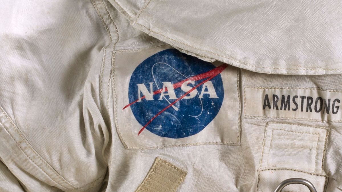
The emblem was used in the “golden age” of NASA from 1959 to 1975. The spacecraft decorated with it explored the main planets of the solar system, and American astronauts left their footprints on the lunar surface with it.
The logo of the “future”
Despite all the outstanding achievements made under the blue emblem in the mid-1970s, quite unexpectedly for both space enthusiasts and most of its employees, NASA abandoned its use in favor of a different logo. But why did this happen?
The fact is that in the early 1970s, many American federal agencies decided to update their attributes. The Space Agency was no exception. Through rebranding, the management sought to demonstrate to the world that the organization had been renewed and that the “modern” era of space exploration had begun. The decision also had a practical side: the original NASA emblem was quite difficult to print.

The New York-based studio Danne & Blackburn was commissioned to design the new emblem. In 1974, it presented a minimalist red logo that represented the word NASA in a unique style of writing. The horizontal stripes inside the letter “A” were removed, which, according to the designers, was supposed to make it look like a rocket. In 1975, the NASA management officially approved this design as the new emblem of the organization.
It is worth noting that not all employees of the aerospace administration welcomed the change. The red logo quickly earned the nickname “worm”. Many NASA veterans categorically rejected it and almost sabotaged the redesign process because of their attachment to the “meatball”.

Nevertheless, the decision was made. For the next 17 years, the worm remained the official emblem of NASA. Under this logo, the aerospace administration launched the Viking spacecraft to Mars and the Voyager probes to the giant planets, and it adorned the wings of the shuttles and the Hubble Space Telescope.
The return of the “meatball” and the second life of the “worm”
In 1992, Dan Goldin was appointed administrator of NASA. In those years, the organization was going through a difficult time. It was still trying to cope with the aftermath of the Challenger shuttle disaster, while the project for an ambitious new space exploration program was not funded. All of this was compounded by problems with the development of the International Orbital Station project, which was teetering on the brink of closure. In addition, a defect was found in the main mirror of the recently launched Hubble telescope, which made NASA the target of merciless criticism.
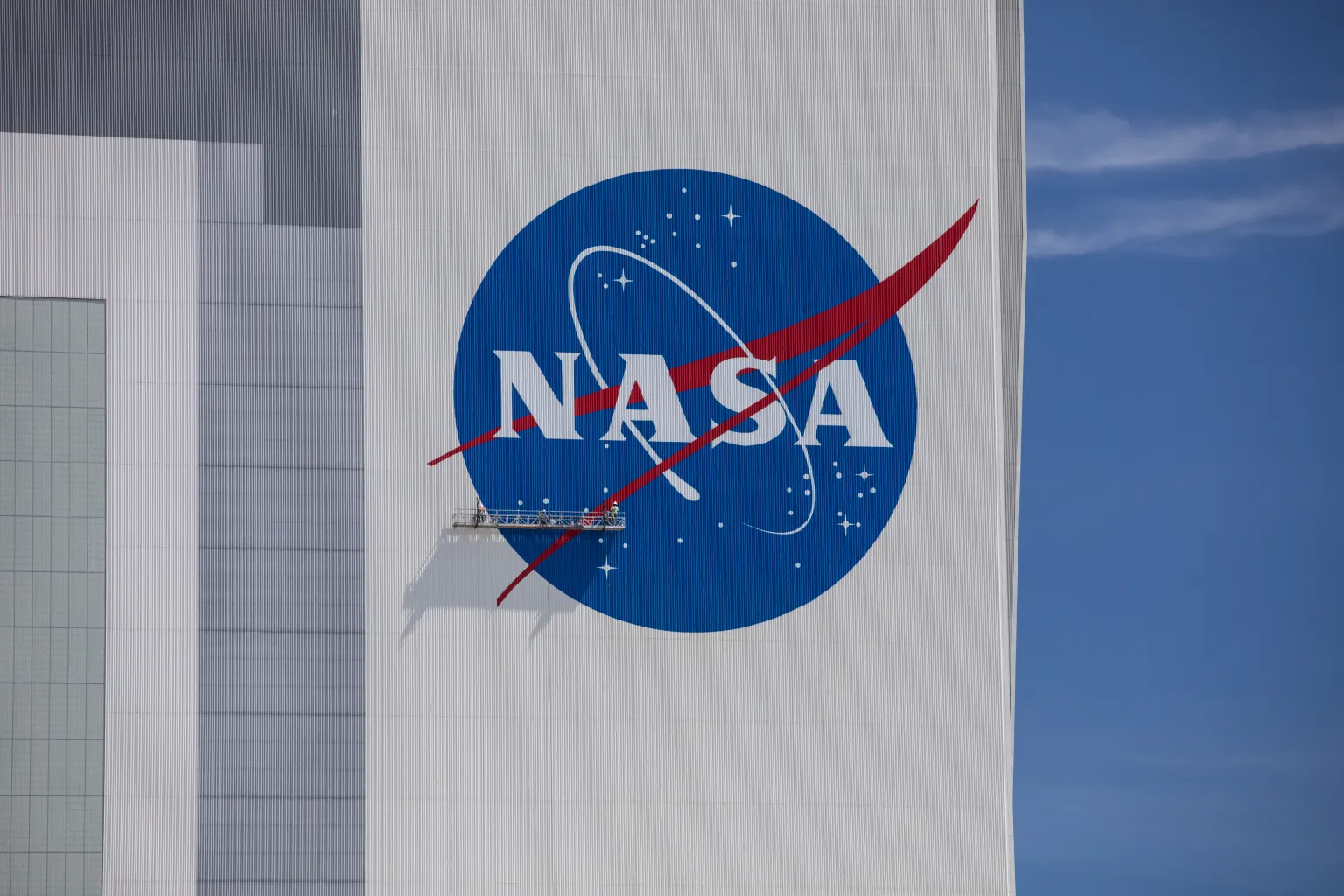
In this situation, the new leader tried to boost the organization’s sagging morale by bringing back the old logo, which was supposed to remind everyone of its great past. According to legend, he decided to do this during a visit to the Langley Research Center. It is claimed that when he saw the huge NASA lettering that adorned the hangar, Goldin exclaimed, “Why do we have such a terrible logo?” And the very next day, a decision was made to bring back the “meatball”. Since then, it has once again become the official emblem of NASA. At the moment, it seems unlikely that the aerospace administration will want to abandon its most famous symbol again or change its design in any way soon.
As for the “worm”, after 1992, for quite some time, it could only be found on souvenirs and at some anniversary events dedicated to space missions. But, as often happens, the controversy that accompanied its introduction was gradually forgotten, and over time, the red logo acquired a nostalgic status in the eyes of many space enthusiasts who wanted to see it again on space technology.

NASA employees noticed this trend. Although the organization did not officially return the “worm”, it still found a way to honor the logo that had served it faithfully for 17 years. In 2020, the branded red inscription was applied to the body of the Falcon 9 rocket that sent the first manned Crew Dragon into space. According to the aerospace agency, the decision was motivated by a desire to emphasize a new stage in the history of American astronautics. Since then, the “worm” and the “meatball” have been decorating the sides of Falcon 9 rockets launched by SpaceX. Thus, the longstanding confrontation between the two iconic logos has finally come to an end, and now they serve a common cause together.
This article was published in Universe Space Tech magazine #1 (189) 2023. You can buy this issue in the electronic version in our store.
