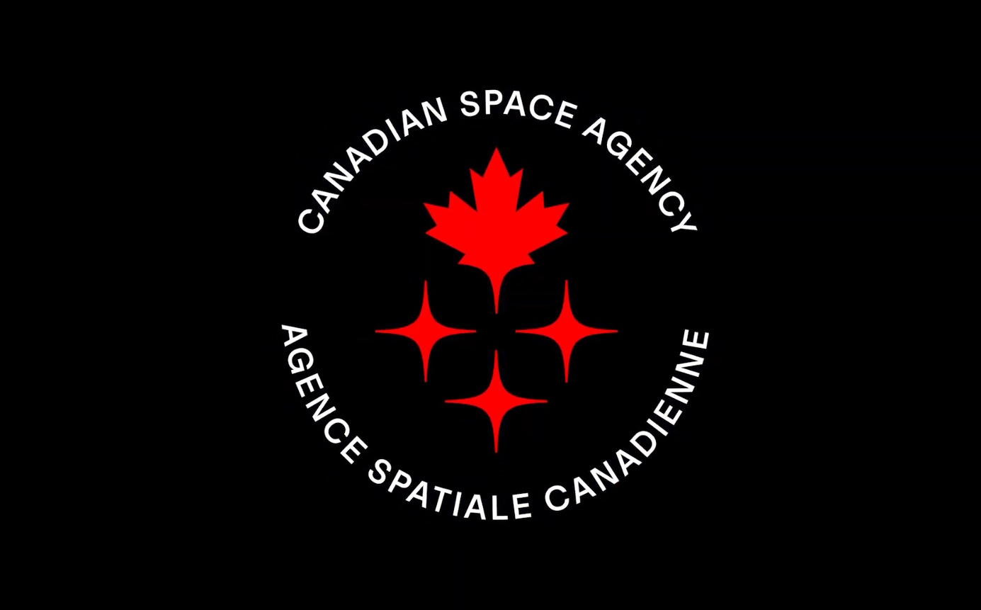
The Canadian Space Agency (CSA) has presented its updated logo. The new logo turned out to be quite concise, but at the same time symbolic and truly “Canadian” — with a maple leaf on the background of the starry sky. “The maple leaf generates pride and a sense of belonging, and is also recognized all over the world,” the CSA said in a statement.
The three stars in the logo, at first glance, seem quite clear. But Canadians insist on their subtle definition: they symbolize space, as well as brilliance, intelligence and experience.
“The three identical stars under the maple leaf represent the strength of the community, which includes all those involved in the Canadian space program – industry, scientists, academia, government, and STEM organizations,” the Canadian Space Agency explains.
However, apart from the simple symbolism, the updated look gives CSA the opportunity to modernize its brand as it strives even further to the stars. “An exciting era of space exploration is unfolding before us, and the CSA seeks to enter this new chapter with a modern identifying symbol,” the statement said.
One of the main goals of the future era is to create a new manipulator that will be even more useful than the existing Canadarm2. It is planned that the new autonomous Canadarm3 will use its advanced software to perform tasks while orbiting the Moon without human intervention.
“In addition to performing maintenance and repair duties, Canadarm3 will help spacecraft carrying out crewed missions dock to space stations orbiting the Moon,” the CSA document says, including NASA’s expected Artemis III mission, which is scheduled for December 2025.
Although some people see a comic picture in the logo, where something is covered with a maple leaf in space. And what do you see?
Follow us on Twitter to get the most interesting space news in time
https://twitter.com/ust_magazine
